Contact centers are fast-paced environments with a great deal of resource management for a varying number of customer enquiries. It is so easy to get over or under-staffed during the day depending on the call volumes. Here are the three pillars of a great contact center dashboard and how to use them to maximise service levels with the optimum agent occupancy.
Meaningful Data for Higher Agent Utilisation and Service Levels
At customer service operations, the goal is to answer customer enquiries as quickly as possible which is often called service levels. The challenge here is that the call volumes and handle times vary depending on many factors and often it is hard to predict accurately. Dashboards can help business stakeholders, team leaders and the reps to manage this dynamic environment efficiently.
Easy to Create, Update and ShareCustomer service dashboards should be created and modified easily by the team leaders or other users without any expert knowledge required. This helps to adjust the visibility and update the indicators quickly during the day.
Easy to Access and Review:
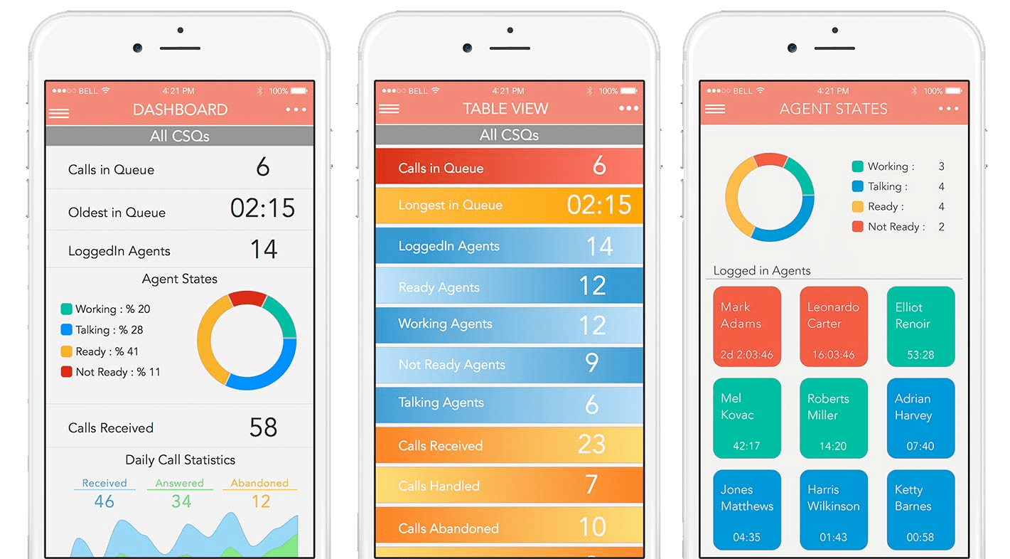
Even though they are called dashboards or wallboards, easy access to the key data from mobile as well as desktop is critical to see the stress points quickly from anywhere. Ability to share the designed dashboards with the others with a weblink or a dedicated mobile app makes the meaningful data more accessible.
Dynamic Notifications for Quick Actions
Getting notified when certain thresholds are reached is important for resourcing the extra demand quickly. Dashboard applications should be able to offer;
- visual and audio notifications
- dynamic scrolling messages
- desktop screen-pops
- SMS and email alerts
to the right recipient so that extra resource needs can be fulfilled by the agents from other skills and agents who are off-shift.
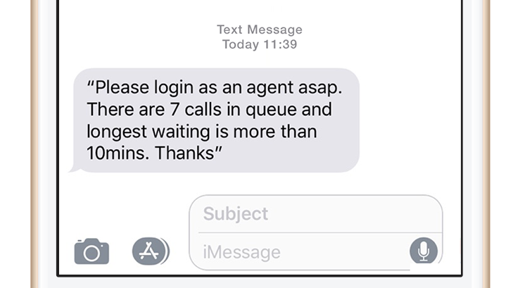
Off-shift agents can login using the mobile agent apps and start taking customer calls from their mobile phone lines, if they are available. Other employees who are not full time customer service reps can also login as agents or reps from other skills can get re-skilled dynamically if needed.
Ready to Use Key Performance Indicators
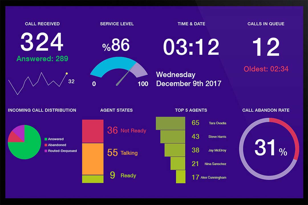
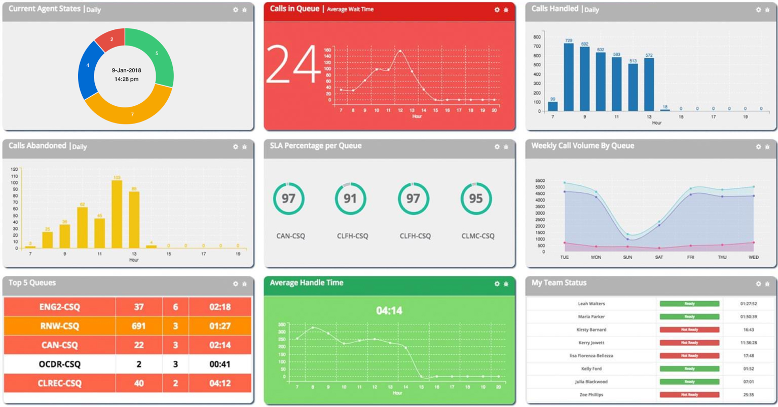
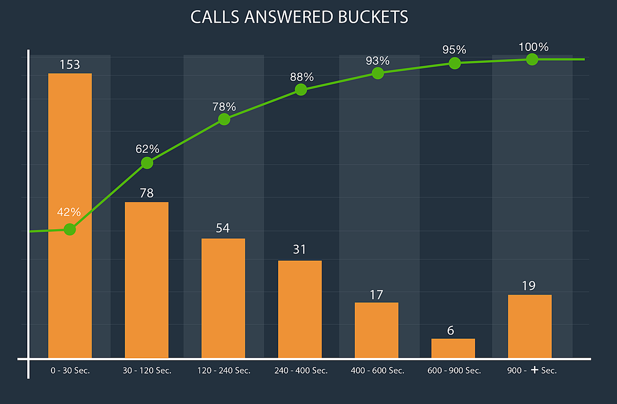
Large repository of key performance indicators in the graphical format helps to see the trend during the day and to be able to address issues quickly.
It is not just the calls in queue/oldest in queue but also the indicators about agent efficiency, overall workforce utilisation and the peak times for the call volumes, average wait time help to manage the rest of the day easily.
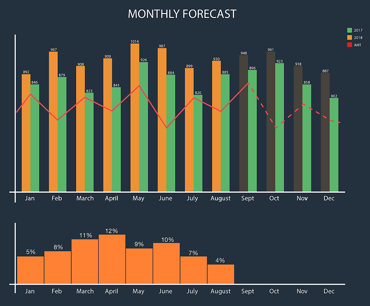
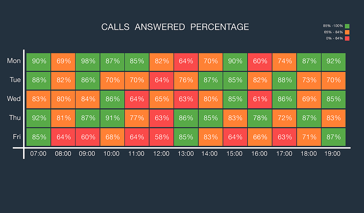
Historical Dashboards
Ability to see the historical data is particularly important for the business stakeholders and resource planners. Features such as weekly heat maps for the last couple months and year-on-year data help to plan ahead for the resourcing and skill management.
Dashboards are a great way to visualise the large amount of data at your contact center. Specialist applications offer better performance, refresh rates and pre-defined indicators that generic reporting tools lack. You can access to many indicators widely used within the industry and easily present the performance to the stakeholders.